Author Adam Aron needed a hand adapting existing charts and graphs, and creating new graphics for his recently published book, The Climate Crisis. Released December 2022, the book explores the mechanisms and impacts of the climate crisis, traces the history and reasons behind the lack of serious effort to combat it, describes ongoing skepticism and how to shift it, and motivates an urgent program of action.
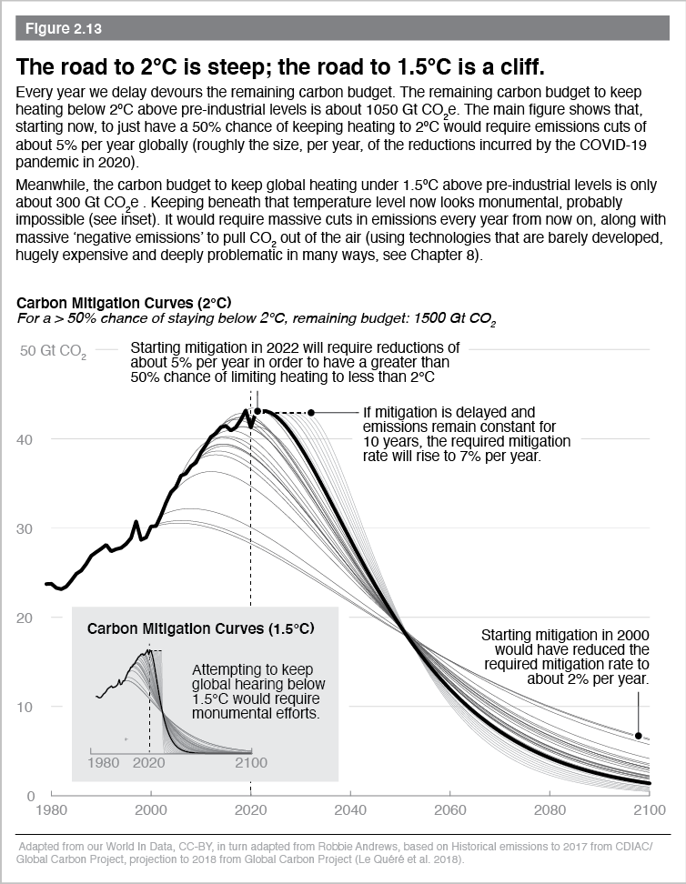
For this particular data graphic, the challenge was to highlight the current ideal scenario (beginning to curb carbon emissions in 2020) against a variety of other scenarios (if we had started mitigation in 2000, if we delay mitigation for another 10 years, etc). With thoughtful use of color and line thickness, we were able to focus on the relevant data and let the rest (axes, other data) recede to the background.
In addition, rather than explain most of the implications in the accompanying text, we overlaid contextual descriptions directly onto the graphic to reduce the need for the reader to flip back and forth between the two. This reduces work for the reader, helps improve comprehension, and ensures that readers who are flipping through the book and don’t necessarily read all of the text still fully understand the graphic.